How to Design the Perfect Logo for Hat Embroidery: 5 Expert Tips
How to Design the Perfect Logo for Hat Embroidery: 5 Expert Tips
Custom embroidered hats are a powerful branding tool, offering a premium look and long-lasting durability. However, designing a logo specifically for embroidery is quite different from designing one for print or digital media. To ensure your brand looks sharp and professional, you need to understand the unique requirements of the embroidery process. Here are five expert tips to help you design the perfect logo for hat embroidery.
1. Keep It Simple and Bold
When it comes to embroidery, simplicity is key. Complex designs with intricate details, tiny text, or delicate gradients often do not translate well into thread. The embroidery machine has to recreate your design using physical stitches, which naturally have limitations in precision compared to a digital printer. Opt for clean, bold lines and solid shapes. A minimalist approach not only ensures that your logo looks crisp but also makes it instantly recognizable from a distance.
2. Mind Your Typography and Text Size
Text is one of the most challenging elements in hat embroidery. If the letters are too small or the font is too thin, the thread can bunch up, making the text illegible. As a general rule, any text in your embroidered logo should be at least 0.25 inches (about 6mm) tall. Sans-serif fonts are usually the best choice, as the clean edges are easier to stitch. If your logo features a complex script or serif font, consider simplifying it or using a monogram version for your hats.
3. Choose the Right Colors and Contrast
Color choice is crucial for a successful embroidery design. Unlike digital printing, which can produce millions of colors and smooth gradients, embroidery relies on solid thread colors. Avoid using gradients, drop shadows, or overly subtle color variations, as these are difficult to replicate with thread. Instead, choose a limited palette of solid, contrasting colors. High contrast ensures that your logo stands out clearly against the fabric of the hat, providing maximum impact and readability.
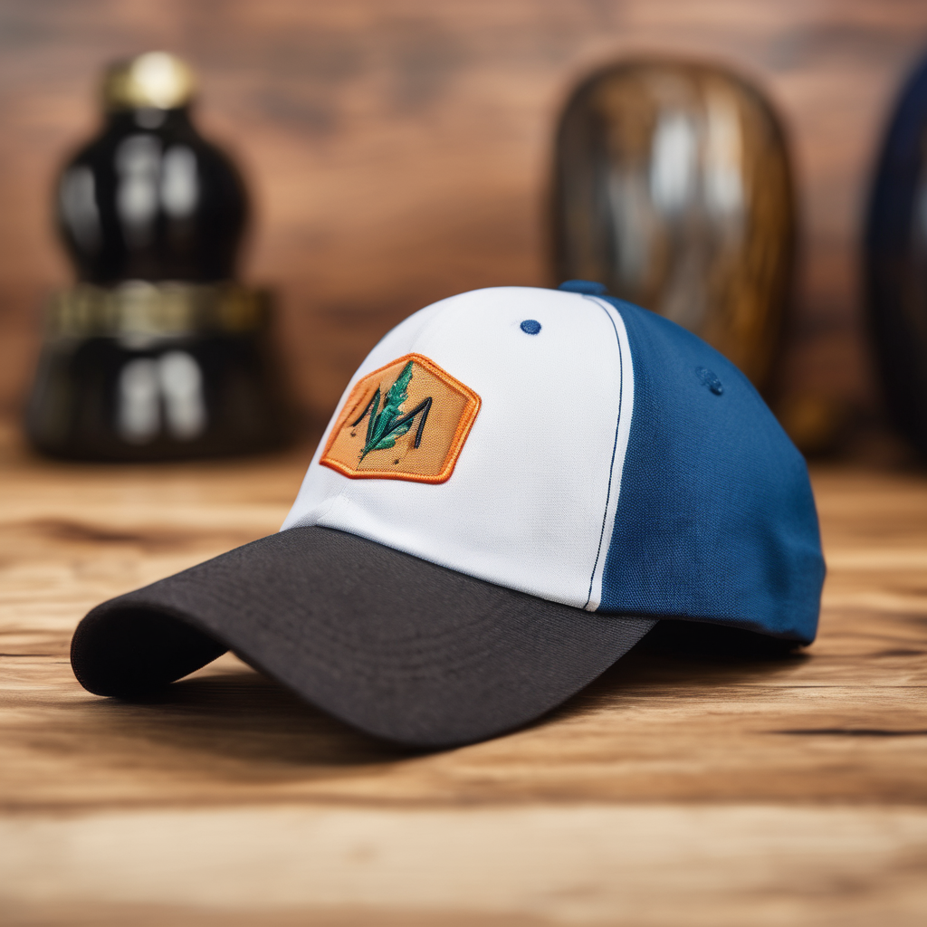
4. Design with the Hat’s Shape in Mind
Hats have a curved surface and a limited printable area, typically around 2.25 inches tall and 4 inches wide for the front of a standard baseball cap. When designing your logo, keep this specific canvas in mind. A logo that is too tall may distort on the curve of the hat, while a design that is too wide might get lost on the sides. Circular, square, or slightly horizontal designs tend to work best. If you are looking for top-tier results, you can always rely on the high-quality custom hat embroidery from Polished Image Wear to ensure your design is perfectly adapted to the hat’s structure.
5. Consider the Fabric and Stitch Types
Different fabrics interact with embroidery thread in various ways. A thick, structured trucker hat will hold dense stitching better than a soft, unstructured dad hat. Additionally, understanding different stitch types can elevate your design. For example, a satin stitch is great for text and borders, while a fill stitch is ideal for solid areas. Some designs might even benefit from 3D puff embroidery, which adds a raised, tactile element to your logo. To get the best advice on fabric compatibility and stitch options, explore the professional embroidery services at Polished Image Wear.
Designing a logo for hat embroidery requires a strategic approach, focusing on simplicity, legibility, and the physical constraints of thread and fabric. By following these five expert tips, you can create a stunning, professional-looking embroidered hat that perfectly represents your brand.
Post Comment